The understated shade that makes buyers walk slower
On a grey Saturday in Manchester, the queue outside number 47 was politely British: huddled coats, takeaway coffees, a couple arguing softly about schools. Same street of red-brick semis, same estate agent boards, same drizzle. But as people inched closer, something odd kept happening. Viewers slowed down at the gate, straightened their shoulders, and actually smiled before they rang the bell.
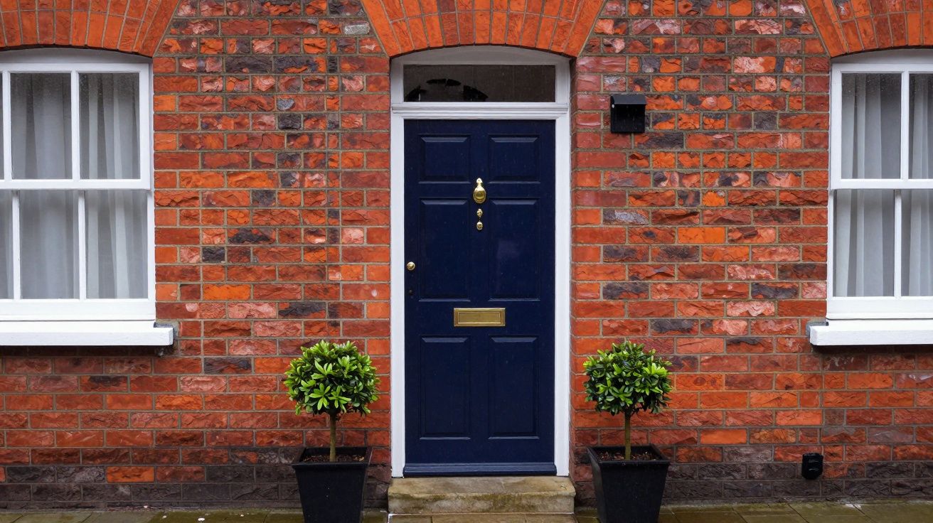
The only real difference between 47 and the rest of the road was staring them in the face: a freshly painted, deep navy front door. Not the shouty royal blue of a football scarf, but an almost-ink shade that looked black in the rain and rich blue when the light caught it. Later, over the paperwork, the agent admitted that in his office they have a joking name for that colour.
“Estate-agent navy,” he said. “We see it, we add a couple of grand to what we think people will offer.”
You don’t renovate the kitchen for the cost of a tin of paint. You don’t fix the roof in an afternoon. But you can repaint a front door. And, quietly, that one change is one of the few upgrades estate agents consistently say nudges offers up by thousands, not tens.
From “just another listing” to “this feels looked after”
Navy sounds almost boring written down. In photos, it isn’t. Scroll through any property portal and your eye does a little double-take at doors in deep, inky blue. They look deliberate without screaming for attention. In a typical UK street of scuffed whites and faded greens, that’s enough to make your place feel like the best-kept on the row.
One London agent told me about a two-bed terrace in Walthamstow that stuck for weeks. Viewings were fine, feedback was polite, but no one stretched beyond asking price. The vendor finally agreed to spend a weekend on the outside: navy door, polished brass letterbox, scrubbed stone step. Same photos, same price, new front shot. The next open day, two couples went into a quiet bidding war. Nothing else had changed.
Why did the door carry that much weight? Because buyers don’t walk up your path holding a survey. They walk up holding a feeling. A deep navy door says: someone cares about this place, but they haven’t gone rogue with a lime-green experiment you’ll have to undo.
Why estate agents love deep navy (and buyers rarely argue with it)
We like to think we’re rational about houses: square footage, EPC rating, local catchment. Then a freshly painted front door makes us decide we’d be happier living here. Agents know this, even if they don’t always say it out loud.
Here’s what that “estate-agent navy” quietly does:
- Photographs better than black. On camera, true black doors can turn into featureless holes. Deep navy keeps its outline and looks expensive, not gloomy.
- Feels calmer than red. Bold red doors divide opinions. Navy is confident but neutral; almost no buyer puts it on their mental “I’ll need to paint that immediately” list.
- Flatters brick and stone. It works against warm London stock brick, cool Yorkshire stone, pebble-dash, even painted render. That versatility is gold in a mixed UK street.
- Hides grime and fingerprints. Dark but not jet black means less visible dust, muddy handprints, or paw smears between cleans.
Let’s be honest: nobody says at a viewing, “I’m offering £5,000 more because of that door.” But they do say, “This one just feels nicer,” then stretch a bit because they don’t want to lose it. The offer letter doesn’t show the paint, but the psychology is baked in.
The shade that works on almost every UK home
“Paint it navy” sounds simple. Choosing the right navy is where the magic sits.
You’re aiming for deep, almost-black blue-think midnight, not school uniform. Some paints call it ink, midnight, rail, or heritage navy. If it looks obviously blue from across the street, go one step darker on the tester card.
A quick guide:
| Door colour choice | What buyers tend to feel |
|---|---|
| Deep navy / inky blue | Smart, calm, well-kept, “move-in ready” |
| Bright primary blue | Cheerful but a bit personal; “may repaint” |
| Solid black | Formal, sharp, sometimes harsh or funereal |
A few more tiny but powerful tweaks:
- Satin or eggshell, not high-gloss, for period homes - elegance without the car-showroom shine.
- High-gloss works well on modern or Victorian-with-attitude terraces, especially with chrome or polished brass hardware.
- Cooler navies (with a hint of grey) suit white-rendered or new-build houses.
- Warmer navies (with a whisper of green) flatter yellow or red brick.
Stand across the street with your tester board at different times of day. If it still looks rich at 4 p.m. in February light, you’ve picked well.
How to get “estate-agent navy” right in a single weekend
You don’t need to be a decorator. You just need to be methodical for one Saturday, then smug for your next valuation.
- Clean like you mean it. Sugar soap, warm water, and a soft scourer. Get rid of grease, spider webs, traffic film. Let it dry fully.
- Key the surface. A light sand so the new paint grips. Fill any chips, sand again, dust off. No one does this every year-but doing it once before selling is worth it.
- Prime if you need to. Bare wood, flaky old gloss, or a dramatic colour change (red to navy) all need an undercoat or primer. The tin will tell you.
- Two thin coats, not one thick one. Follow the recoat times. Rushing gives you sticky fingerprints and brush marks buyers will notice.
- Upgrade the jewellery. A £25 letterbox, £15 numerals, and a new handle in brass or chrome can lift the whole front like a good pair of shoes.
If your door is uPVC or composite, check the paint is designed for it. Many UK brands now do specific exterior multi-surface ranges that cling well and don’t peel.
Small extras that quietly add more than they cost
A navy door is the headline. A few supporting acts can turn “nice” into “this is the one.”
- Door number: Clear, modern numerals or classic brass - not a fading sticker.
- Doormat: Clean, neutral, large enough to feel generous by the threshold.
- Plants: Two matching pots with hardy evergreens signal care, not gardening obsession.
- Lighting: A working, warm-toned wall light above or beside the door flatters the paint and makes evening viewings feel safer and more welcoming.
- Step and path: A quick jet wash or a stiff brush and hot soapy water can make decades of grime vanish in an hour.
Estate agents routinely talk about “kerb appeal” adding a few thousand in perceived value. A deep navy door plus these details is the shortest route to that effect without scaffolding or skips.
When navy isn’t the right answer
There are a few cases where copying the estate-agent favourite isn’t ideal.
- Listed buildings or strict conservation areas may have rules on colours; check before you paint.
- Strongly coloured period schemes (think a Georgian terrace with emerald fanlights and cream pilasters) might be better served by a very dark green or classic black in keeping with the row.
- Ultra-modern builds with lots of glass and aluminium sometimes look sharper with charcoal or black to match the frames.
The test is simple: does the navy look like it belongs, or like it’s trying too hard? If in doubt, walk the surrounding streets. If you can’t imagine your chosen shade on three other houses nearby, choose the next more subtle option on the card.
Turning a tin of paint into a better offer
For most homes, especially bog-standard semis and terraces, a deep navy door is the sweet spot between personality and broad appeal. Estate agents won’t write “thanks for the paint choice” on your completion statement, but they do quietly bump their expectations when they see that colour, that finish, and that sense of care.
You can’t control the market. You can control what a buyer feels in the five seconds between seeing your listing photo and picturing themselves putting their own key in that lock. That’s what you’re really painting.
FAQ:
- Does painting my front door navy really add value, or just help it sell faster? In practice, agents say it does both. A smart, widely liked door colour tends to increase perceived quality, which often translates into slightly higher offers and fewer buyers asking for “a bit off” to do cosmetic work.
- Will a bold colour like yellow or teal put buyers off? Some will love it, some won’t. Deep navy is popular because almost nobody dislikes it enough to mentally budget for repainting, which is where you risk losing money at offer stage.
- Can I paint a rented home’s door? Only with your landlord’s written permission. If you can’t change the colour, focus on cleaning, hardware (with approval), and plants to boost kerb appeal instead.
- Is it worth paying a professional decorator? If your door is in poor condition, highly detailed, or you’re short on time, a pro finish can be worth it-especially if you’re selling a higher-value property where first impressions are scrutinised.
- Should I match the door colour to my windows or garage door? You don’t have to match exactly, but aim for a family resemblance. Deep navy with white frames is a classic. If other external elements are dark, keep them in the same cool or warm family so the whole frontage feels intentional, not patchwork.


Comments (0)
No comments yet. Be the first to comment!
Leave a Comment